
TextField
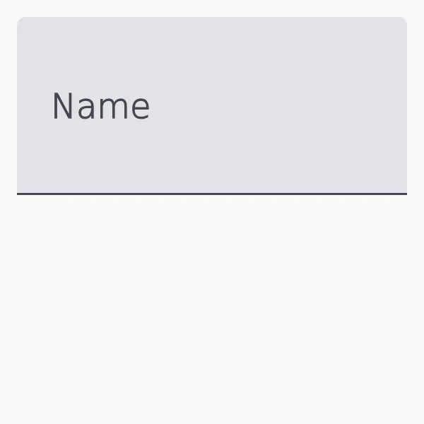
A widget used to enter a single line of text with additional features like icons and supporting text.
Properties
Section titled “Properties”enabled
Section titled “enabled”booldefault: true
When false, the text field is disabled and cannot be interacted with.
has-error
Section titled “has-error”booldefault: false
Indicates whether the text field should display an error state.
has-focus
Section titled “has-focus”bool(out)
Set to true when the text field currently has the focus.
stringdefault: ""
The label text displayed above the text input.
leading-icon
Section titled “leading-icon”imagedefault: the empty image
An icon displayed at the beginning of the text input.
supporting-text
Section titled “supporting-text”stringdefault: ""
Additional text displayed below the text input, often used for hints or error messages.
string(in-out)default: ""
The text being edited.
trailing-icon
Section titled “trailing-icon”imagedefault: the empty image
An icon displayed at the end of the text input.
input-type
Section titled “input-type”enum InputTypedefault: text
Use this to configure TextInput for editing special input, such as password fields.
Functions
Section titled “Functions”set-selection-offsets(anchor: int, focus: int)
Section titled “set-selection-offsets(anchor: int, focus: int)”Selects the text between two UTF-8 offsets: anchor is the end of the selection that stays put and focus the end the cursor moves to, so focus may precede anchor to select backwards.
Pass the same value for both to place the text cursor at that offset without selecting anything.
select-all()
Section titled “select-all()”Selects all text in the text field.
clear-selection()
Section titled “clear-selection()”Clears the current text selection.
Copies the selected text to the clipboard and removes it from the text field.
copy()
Section titled “copy()”Copies the selected text to the clipboard.
paste()
Section titled “paste()”Pastes the text content of the clipboard at the cursor position.
Callbacks
Section titled “Callbacks”accepted(string)
Section titled “accepted(string)”Invoked when the enter key is pressed.
edited(string)
Section titled “edited(string)”Emitted when the text has changed because the user modified it.
key-pressed(KeyEvent) -> EventResult
Section titled “key-pressed(KeyEvent) -> EventResult”Invoked when a key is pressed, the argument is a KeyEvent struct. Use this callback to handle keys before TextField does. Return accept to indicate that you’ve handled the event, or return reject to let TextField handle it.
key-released(KeyEvent) -> EventResult
Section titled “key-released(KeyEvent) -> EventResult”Invoked when a key is released, the argument is a KeyEvent struct. Use this callback to handle keys before TextField does. Return accept to indicate that you’ve handled the event, or return reject to let TextField handle it.
leading-icon-clicked()
Section titled “leading-icon-clicked()”Invoked when the leading icon is clicked.
trailing-icon-clicked()
Section titled “trailing-icon-clicked()”Invoked when the trailing icon is clicked.
© 2026 SixtyFPS GmbH