
ActionChip
import { ActionChip } from "@material";export component Example inherits Window { width: 200px; height: 100px; background: transparent; ActionChip { text: "Action"; icon: @image-url("../icons/add.svg"); width: 100px; height: 32px; }}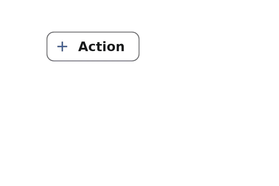
An ActionChip is a compact element that represents an action or choice. It can contain text, icons, and avatars, and is commonly used in forms, search interfaces, and other interactive areas.
Properties
Section titled “Properties”avatar-icon
Section titled “avatar-icon”imagedefault: the empty image
An optional avatar image displayed on the chip.
avatar-background
Section titled “avatar-background”colordefault: #00000000
The background color for the avatar.
enabled
Section titled “enabled”booldefault: true
Whether the chip is enabled and can be interacted with.
has-focus
Section titled “has-focus”booldefault: false
Whether the component has focus.
imagedefault: the empty image
An optional icon displayed on the chip.
stringdefault: ""
The text label displayed on the chip.
tooltip
Section titled “tooltip”stringdefault: ""
A tooltip text that appears when hovering over the chip.
Callbacks
Section titled “Callbacks”clicked()
Section titled “clicked()”Invoked when the chip is clicked.
functions
Section titled “functions”clear-focus()
Section titled “clear-focus()”Clears the focus from the component.
focus()
Section titled “focus()”Focuses the component.
© 2026 SixtyFPS GmbH