
InputChip
import { InputChip } from "@material";export component Example inherits Window { width: 200px; height: 100px; background: transparent; InputChip { text: "Input"; leading-icon: @image-url("../icons/edit.svg"); trailing-icon: @image-url("../icons/close.svg"); width: 120px; height: 32px; }}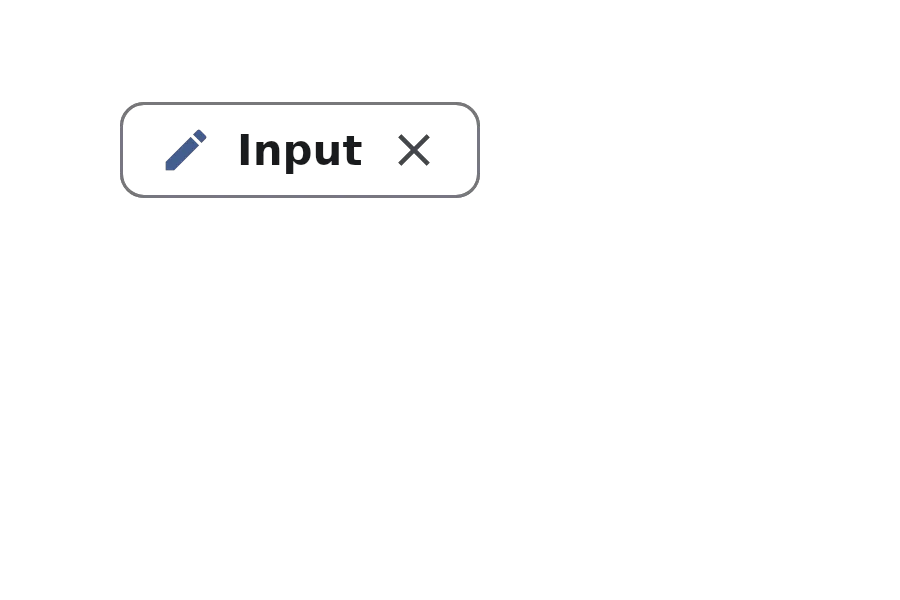
An InputChip is a compact element that represents user input or selections. It can contain text, leading icons, trailing icons, and avatars. Input chips are commonly used to display user-entered information like tags, contacts, or filter selections, and often include a trailing action like a close button.
Properties
Section titled “Properties”avatar
Section titled “avatar”imagedefault: the empty image
An optional avatar image displayed on the chip.
avatar-background
Section titled “avatar-background”colordefault: #00000000
The background color for the avatar.
checkable
Section titled “checkable”booldefault: false
Whether the chip can be toggled between checked and unchecked states.
checked
Section titled “checked”bool(in-out)default: false
Whether the chip is in the checked (selected) state. Only relevant when checkable is true.
enabled
Section titled “enabled”booldefault: true
Whether the chip is enabled and can be interacted with.
has-focus
Section titled “has-focus”booldefault: false
Whether the component has focus.
leading-icon
Section titled “leading-icon”imagedefault: the empty image
An optional icon displayed at the beginning of the chip.
stringdefault: ""
The text label displayed on the chip.
tooltip
Section titled “tooltip”stringdefault: ""
A tooltip text that appears when hovering over the chip.
trailing-icon
Section titled “trailing-icon”imagedefault: the empty image
An optional icon displayed at the end of the chip, commonly used for actions like closing or removing the chip.
Callbacks
Section titled “Callbacks”clicked()
Section titled “clicked()”Invoked when the main area of the chip is clicked.
trailing-icon-clicked()
Section titled “trailing-icon-clicked()”Invoked when the trailing icon is clicked. This is typically used for actions like removing the chip.
Functions
Section titled “Functions”clear-focus()
Section titled “clear-focus()”Clears the focus from the component.
focus()
Section titled “focus()”Focuses the component.
toggle()
Section titled “toggle()”Toggles the chip state between checked and unchecked. Only has an effect when checkable is true.
© 2026 SixtyFPS GmbH