Make your product shine
Stand out from the crowd with an award winning design system. Material components aren't just functional, they are beautiful.
It's never been easier to build a touch based device. Combine Slint's production grade toolkit with everyone's favorite Material Design Components
Get Started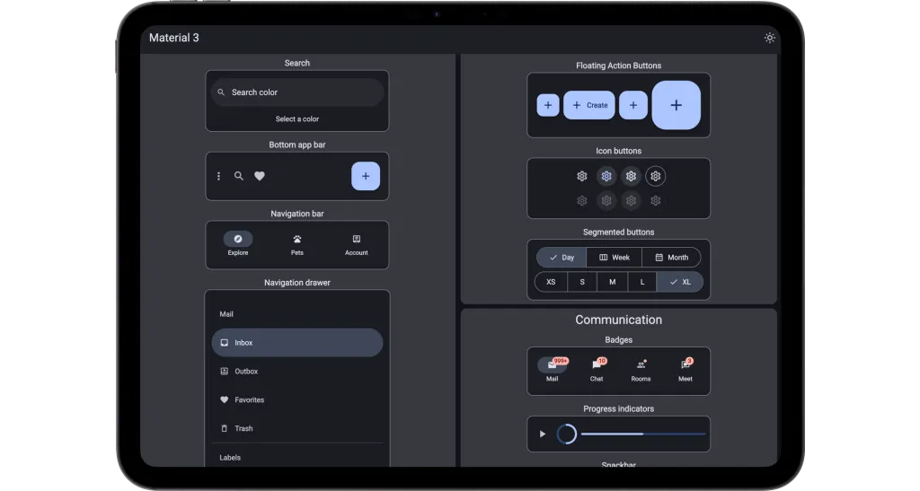
Features
But every product should have a great design.
Stand out from the crowd with an award winning design system. Material components aren't just functional, they are beautiful.
There has never been an easier way to build a Material design product. Slint's simple syntax and powerful tooling will have you shipping in days.
Build your product with the world's most used design system. It's been the foundation of Android phones since 2014 and proven in billions of devices.
Watches, medical devices, in-car infotainment, and more. Material UI components work seamlessly across desktop, mobile, and embedded platforms.
Designed specifically for touch interfaces with appropriate touch targets and gestures.
Easy theming with Material Theme builder support, allowing you to match your brand colors and design preferences.
Android user? Download the APK and try the gallery on your phone. Otherwise try out the browser version.
Components
Essential components for building modern Slint applications with Material Design
'%20d='M8%2013v-8.5a1.5%201.5%200%200%201%203%200v7.5'%20/%3e%3cpath%20stroke='url(%23gradient-main)'%20d='M11%2011.5v-2a1.5%201.5%200%200%201%203%200v2.5'%20/%3e%3cpath%20stroke='url(%23gradient-main)'%20d='M14%2010.5a1.5%201.5%200%200%201%203%200v1.5'%20/%3e%3cpath%20stroke='url(%23gradient-main)'%20d='M17%2011.5a1.5%201.5%200%200%201%203%200v4.5a6%206%200%200%201%20-6%206h-2h.208a6%206%200%200%201%20-5.012%20-2.7l-.196%20-.3c-.312%20-.479%20-1.407%20-2.388%20-3.286%20-5.728a1.5%201.5%200%200%201%20.536%20-2.022a1.867%201.867%200%200%201%202.28%20.28l1.47%201.47'%20/%3e%3cpath%20stroke='url(%23gradient-main)'%20d='M5%203l-1%20-1'%20/%3e%3cpath%20stroke='url(%23gradient-main)'%20d='M4%207h-1'%20/%3e%3cpath%20stroke='url(%23gradient-main)'%20d='M14%203l1%20-1'%20/%3e%3cpath%20stroke='url(%23gradient-main)'%20d='M15%206h1'%20/%3e%3c/svg%3e)
Multiple button variants including filled, outlined, and tonal styles for different interaction contexts.
'%20stroke-width='2'%20stroke-linecap='round'%20stroke-linejoin='round'%20class='icon%20icon-tabler%20icons-tabler-outline%20icon-tabler-files'%3e%3cdefs%3e%3clinearGradient%20id='gradient-main'%20x1='0'%20y1='0'%20x2='1'%20y2='1'%3e%3cstop%20offset='0%25'%20stop-color='%233b82f6'%20/%3e%3cstop%20offset='50%25'%20stop-color='%23a21caf'%20/%3e%3cstop%20offset='100%25'%20stop-color='%23ec4899'%20/%3e%3c/linearGradient%3e%3c/defs%3e%3cpath%20stroke='none'%20d='M0%200h24v24H0z'%20fill='none'/%3e%3cpath%20d='M15%203v4a1%201%200%200%200%201%201h4'%20/%3e%3cpath%20d='M18%2017h-7a2%202%200%200%201%20-2%20-2v-10a2%202%200%200%201%202%20-2h4l5%205v7a2%202%200%200%201%20-2%202z'%20/%3e%3cpath%20d='M16%2017v2a2%202%200%200%201%20-2%202h-7a2%202%200%200%201%20-2%20-2v-10a2%202%200%200%201%202%20-2h2'%20/%3e%3c/svg%3e)
Text fields, checkboxes, switches, and other input components for user data collection.
'%20stroke-width='2'%20stroke-linecap='round'%20stroke-linejoin='round'%20class='icon%20icon-tabler%20icons-tabler-outline%20icon-tabler-play-card'%3e%3cdefs%3e%3clinearGradient%20id='gradient-main'%20x1='0'%20y1='0'%20x2='24'%20y2='24'%20gradientUnits='userSpaceOnUse'%3e%3cstop%20offset='0%25'%20stop-color='%233b82f6'%20/%3e%3cstop%20offset='50%25'%20stop-color='%23a21caf'%20/%3e%3cstop%20offset='100%25'%20stop-color='%23ec4899'%20/%3e%3c/linearGradient%3e%3c/defs%3e%3cpath%20stroke='none'%20d='M0%200h24v24H0z'%20fill='none'/%3e%3cpath%20d='M19%205v14a2%202%200%200%201%20-2%202h-10a2%202%200%200%201%20-2%20-2v-14a2%202%200%200%201%202%20-2h10a2%202%200%200%201%202%202z'%20/%3e%3cpath%20d='M8%206h.01'%20/%3e%3cpath%20d='M16%2018h.01'%20/%3e%3cpath%20d='M12%2016l-3%20-4l3%20-4l3%204z'%20/%3e%3c/svg%3e)
Content containers with elevation and various layouts for displaying information in organized, visually appealing ways.
'%20stroke-width='2'%20stroke-linecap='round'%20stroke-linejoin='round'%20class='icon%20icon-tabler%20icons-tabler-outline%20icon-tabler-message-circle'%3e%3cdefs%3e%3clinearGradient%20id='gradient-main'%20x1='0'%20y1='0'%20x2='1'%20y2='1'%3e%3cstop%20offset='0%25'%20stop-color='%233b82f6'%20/%3e%3cstop%20offset='50%25'%20stop-color='%23a21caf'%20/%3e%3cstop%20offset='100%25'%20stop-color='%23ec4899'%20/%3e%3c/linearGradient%3e%3c/defs%3e%3cpath%20stroke='none'%20d='M0%200h24v24H0z'%20fill='none'/%3e%3cpath%20d='M3%2020l1.3%20-3.9c-2.324%20-3.437%20-1.426%20-7.872%202.1%20-10.374c3.526%20-2.501%208.59%20-2.296%2011.845%20.48c3.255%202.777%203.695%207.266%201.029%2010.501c-2.666%203.235%20-7.615%204.215%20-11.574%202.293l-4.7%201'%20/%3e%3c/svg%3e)
Modal interfaces for important actions, confirmations, and detailed information that require user attention.
'%20stroke-width='2'%20stroke-linecap='round'%20stroke-linejoin='round'%20class='icon%20icon-tabler%20icons-tabler-outline%20icon-tabler-navigation'%3e%3cdefs%3e%3clinearGradient%20id='gradient-main'%20x1='0'%20y1='0'%20x2='1'%20y2='1'%3e%3cstop%20offset='0%25'%20stop-color='%233b82f6'%20/%3e%3cstop%20offset='50%25'%20stop-color='%23a21caf'%20/%3e%3cstop%20offset='100%25'%20stop-color='%23ec4899'%20/%3e%3c/linearGradient%3e%3c/defs%3e%3cpath%20stroke='none'%20d='M0%200h24v24H0z'%20fill='none'/%3e%3cpath%20d='M12%2018.5l7.265%202.463c.196%20.077%20.42%20.032%20.57%20-.116a.548%20.548%200%200%200%20.134%20-.572l-7.969%20-17.275l-7.97%2017.275c-.07%20.2%20-.017%20.424%20.135%20.572c.15%20.148%20.374%20.193%20.57%20.116l7.265%20-2.463'%20/%3e%3c/svg%3e)
Drawers, navigation rails, and bottom navigation bars for seamless app navigation and structure.
'%20stroke-width='2'%20stroke-linecap='round'%20stroke-linejoin='round'%20class='icon%20icon-tabler%20icons-tabler-outline%20icon-tabler-layout-navbar'%3e%3cdefs%3e%3clinearGradient%20id='gradient-main'%20x1='0'%20y1='0'%20x2='24'%20y2='24'%20gradientUnits='userSpaceOnUse'%3e%3cstop%20offset='0%25'%20stop-color='%233b82f6'%20/%3e%3cstop%20offset='50%25'%20stop-color='%23a21caf'%20/%3e%3cstop%20offset='100%25'%20stop-color='%23ec4899'%20/%3e%3c/linearGradient%3e%3c/defs%3e%3cpath%20stroke='none'%20d='M0%200h24v24H0z'%20fill='none'/%3e%3cpath%20d='M4%204m0%202a2%202%200%200%201%202%20-2h12a2%202%200%200%201%202%202v12a2%202%200%200%201%20-2%202h-12a2%202%200%200%201%20-2%20-2z'%20/%3e%3cpath%20d='M4%209l16%200'%20/%3e%3c/svg%3e)
Top-level navigation components with actions, titles, and search functionality for your app's main interface.
'%20stroke-width='2'%20stroke-linecap='round'%20stroke-linejoin='round'%20class='icon%20icon-tabler%20icons-tabler-outline%20icon-tabler-loader'%3e%3cdefs%3e%3clinearGradient%20id='gradient-main'%20x1='0'%20y1='0'%20x2='24'%20y2='24'%20gradientUnits='userSpaceOnUse'%3e%3cstop%20offset='0%25'%20stop-color='%233b82f6'%20/%3e%3cstop%20offset='50%25'%20stop-color='%23a21caf'%20/%3e%3cstop%20offset='100%25'%20stop-color='%23ec4899'%20/%3e%3c/linearGradient%3e%3c/defs%3e%3cpath%20stroke='none'%20d='M0%200h24v24H0z'%20fill='none'/%3e%3cpath%20d='M12%206l0%20-3'%20/%3e%3cpath%20d='M16.25%207.75l2.15%20-2.15'%20/%3e%3cpath%20d='M18%2012l3%200'%20/%3e%3cpath%20d='M16.25%2016.25l2.15%202.15'%20/%3e%3cpath%20d='M12%2018l0%203'%20/%3e%3cpath%20d='M7.75%2016.25l-2.15%202.15'%20/%3e%3cpath%20d='M6%2012l-3%200'%20/%3e%3cpath%20d='M7.75%207.75l-2.15%20-2.15'%20/%3e%3c/svg%3e)
Loading spinners and progress bars to provide feedback during operations and data loading.
'%20stroke-width='2'%20stroke-linecap='round'%20stroke-linejoin='round'%20class='icon%20icon-tabler%20icons-tabler-outline%20icon-tabler-bell-ringing'%3e%3cdefs%3e%3clinearGradient%20id='gradient-main'%20x1='0'%20y1='0'%20x2='1'%20y2='1'%3e%3cstop%20offset='0%25'%20stop-color='%233b82f6'%20/%3e%3cstop%20offset='50%25'%20stop-color='%23a21caf'%20/%3e%3cstop%20offset='100%25'%20stop-color='%23ec4899'%20/%3e%3c/linearGradient%3e%3c/defs%3e%3cpath%20stroke='none'%20d='M0%200h24v24H0z'%20fill='none'/%3e%3cpath%20d='M10%205a2%202%200%200%201%204%200a7%207%200%200%201%204%206v3a4%204%200%200%200%202%203h-16a4%204%200%200%200%202%20-3v-3a7%207%200%200%201%204%20-6'%20/%3e%3cpath%20d='M9%2017v1a3%203%200%200%200%206%200v-1'%20/%3e%3cpath%20d='M21%206.727a11.05%2011.05%200%200%200%20-2.794%20-3.727'%20/%3e%3cpath%20d='M3%206.727a11.05%2011.05%200%200%201%202.792%20-3.727'%20/%3e%3c/svg%3e)
Brief notifications that appear at the bottom of the screen to provide feedback and confirm actions.
'%20stroke-width='2'%20stroke-linecap='round'%20stroke-linejoin='round'%20class='icon%20icon-tabler%20icons-tabler-outline%20icon-tabler-info-octagon'%3e%3clinearGradient%20id='gradient-main'%20x1='0'%20y1='0'%20x2='24'%20y2='24'%20gradientUnits='userSpaceOnUse'%3e%3cstop%20offset='0%25'%20stop-color='%233b82f6'%20/%3e%3cstop%20offset='50%25'%20stop-color='%23a21caf'%20/%3e%3cstop%20offset='100%25'%20stop-color='%23ec4899'%20/%3e%3c/linearGradient%3e%3cpath%20stroke='none'%20d='M0%200h24v24H0z'%20fill='none'/%3e%3cpath%20d='M12.802%202.165l5.575%202.389c.48%20.206%20.863%20.589%201.07%201.07l2.388%205.574c.22%20.512%20.22%201.092%200%201.604l-2.389%205.575c-.206%20.48%20-.589%20.863%20-1.07%201.07l-5.574%202.388c-.512%20.22%20-1.092%20.22%20-1.604%200l-5.575%20-2.389a2.036%202.036%200%200%201%20-1.07%20-1.07l-2.388%20-5.574a2.036%202.036%200%200%201%200%20-1.604l2.389%20-5.575c.206%20-.48%20.589%20-.863%201.07%20-1.07l5.574%20-2.388a2.036%202.036%200%200%201%201.604%200z'%20/%3e%3cpath%20d='M12%209h.01'%20/%3e%3cpath%20d='M11%2012h1v4h1'%20/%3e%3c/svg%3e)
Contextual help and information that appears when users hover or focus on interface elements.